


So You Want To Wear Color (Part II)
when the vibe calls for more is more

Hi Readers!
I’m back with a reader-requested follow up to the newsletter from last month where we talked about Meeting Your Unsung Color Heroes.
The often forgotten hero colors like Olive, Grey, and Beige tones that perfectly compliment your favorite bold colors and patterns. I like to think of it as an introduction for neutral lovers who want to experiment with infusing more color into their wardrobe, or want to learn how to style those “how to wear” statement pieces in an approachable way.
Today’s newsletter is going to take it a step further and cover different ways to mix color on color, pattern on pattern, and have more fun with those statement pieces already hanging in your closet!

Here’s what we’ll cover today - in this order but not necessarily in particular order of easiest to hardest or simplest to boldest!
The 3 T’s - Tone, Tint, Texture
Stripe Mixing
Consistency In Color
Consistent In Prints
Another Unsung Color Hero To Introduce You To!
What To Wear Instead Of Your Default White Button Down
What To Wear Instead Of Your Default White Tee
Leopard As A Neutral
Embellished Statement Pieces
Shoes As An Intro To Color
Harmonious Colors
Non-Neutral Neutrals (saving my favorite for last!)
Before we dive in, I want to share this practical tip first:
I know color and patterns can feel a bit bold and intense which is why neutrals can feel like a cozy comfort zone but remember:
You don’t need to have color/print take up a large visual “footprint” on your body. You can easily inject and layer colorful interest through smaller elements like accessories and shoes.
You don’t need to always choose color that sits close to the face. This is where I think a lot of people get stuck. The majority of color I find in clients’ closets are in Tops. It can feel harder to wear colors when you are seeing it right next to your face so if there are colors you like but don’t necessarily love wearing, try moving it farther away!

THE 3 T’s: TONE, TINT, TEXTURE
One of my favorite ways to play with color is creating tonal looks. Not only because I find it to be the easiest, but because it can look incredibly chic!
I think this is a great option if you want to inject more color in your life but love the simplicity and clean impact of neutrals. Essentially, you are creating a visual “wash” with color.
When creating a tonal colorful look, keep in mind the 3 T’s:
Tone - The darker shade which is made less vibrant by adding a bit of gray (or, a mix of black and white). Cheat tip: Just think of “toning down” the color intensity
Tint - A color made lighter by adding white. It could either be directly matching the tone color but it can also just be within a similar color family (ie: pink + coral)
Texture - The element that’s going to help your looks from feeling too intense or too flat

Some other visual examples - notice the tone (darker shade) + tint (lighter shade of the tone) + texture (difference in fabrications, trim details, finishes)

STRIPE MIXING
Ok, I know all of you have some stripes in your closet! So how about we play with some fun easy mix-n-match ideas, shall we?

Option #1: Stripes on Stripes
If you want a bolder cleaner visual, look for stripes of similar width. You can play with inverse colors (ie: Red ground White stripe + White ground Red stripe) or mix-n-match colors.
My personal favorite is a combo of 1 classic stripe + 1 variegated stripe (like the 1st image or last 3 images). It feels a bit more subtle while also being playful.
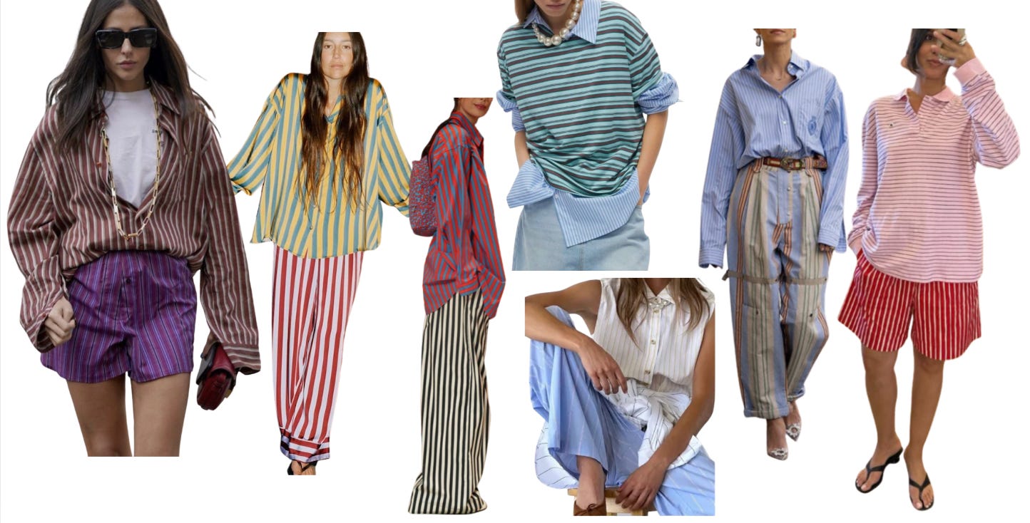

Option #2: Stripes With Track Pants
This is a more specific idea but I love a good track pant or short for casual days. The simple vertical side stripes are the perfect foundation to layer additional stripes on top of. You don’t need a striped pant for this…try with a gingham, a boxer stripe etc.

Option #3: Blue Stripes Are Basically A Neutral
The reason I love an oxford blue solid or stripe button down is that in a lot of ways, it can act as a neutral. Similar to how a pair of light blue jeans or a chambray button down kind of works with anything.

Also, love this idea of playing with stripes and either more stripes or pattern via a scarf or bandana -

CHOOSE A CONSISTENT COLOR STORY
An easy way to play with color and print is to choose two things that share the same color. This will create a visual through-line to help with cohesion, pairing things that “shouldn’t” go together and making them work.

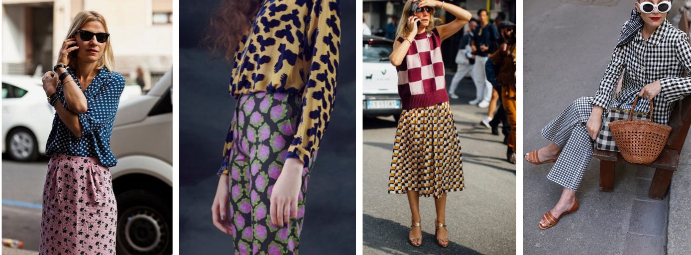
CHOOSE A CONSISTENT PRINT SCALE/STORY
How do you make two very different prints work together? Try to find consistency in scale (the size of a motif in a pattern), or finding a similar print in varying scales. This will help visually tell a cohesive story when the colors may not feel like they would work.

ANOTHER UNSUNG COLOR HERO
In our Unsung Color Hero newsletter, we talked about Olive, Grey, and Beige tones but I’d like to introduce you to yet another great hero color — Brown.
But not like a flat brown…something with a bit of texture by way of fabric or finish or weave, or with an interesting undertone that helps it read more like a Mocha Brown vs a serious Espresso Brown.
The richness and depth of the brown will help ground bolder colors and prints through softer contrast. It can also help visually “lift” and bring out other secondary colors and prints.


Keep reading with a 7-day free trial
Subscribe to The Found Journal to keep reading this post and get 7 days of free access to the full post archives.